At first, the user interface of the Workflow Builder is relatively minimal, but there are many elements that can be opened and may need an introduction. This section aims to show the different parts of the user interface and set you off to a good start building your workflows.
The user interface consists of three main components: the workflow area, the workspace, and the menu bar.
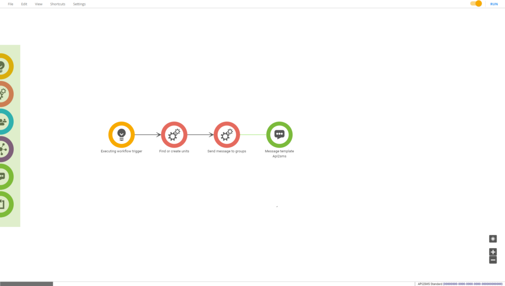
Workflow area
This is where you build your workflow. You can think of it as the table, or a whiteboard, on which you use your tools and resources to build or draw your workflows.
To start building your solution, simply drag and drop your tools and resources to the workflow area from the toolbox on the left. You can then configure them by double-clicking and opening their properties.
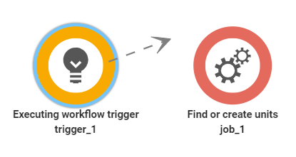
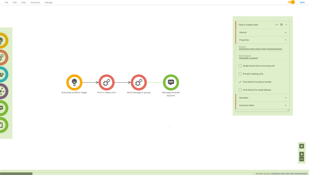
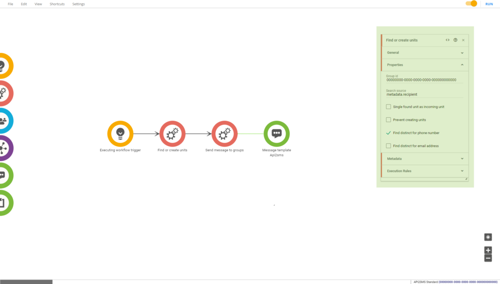
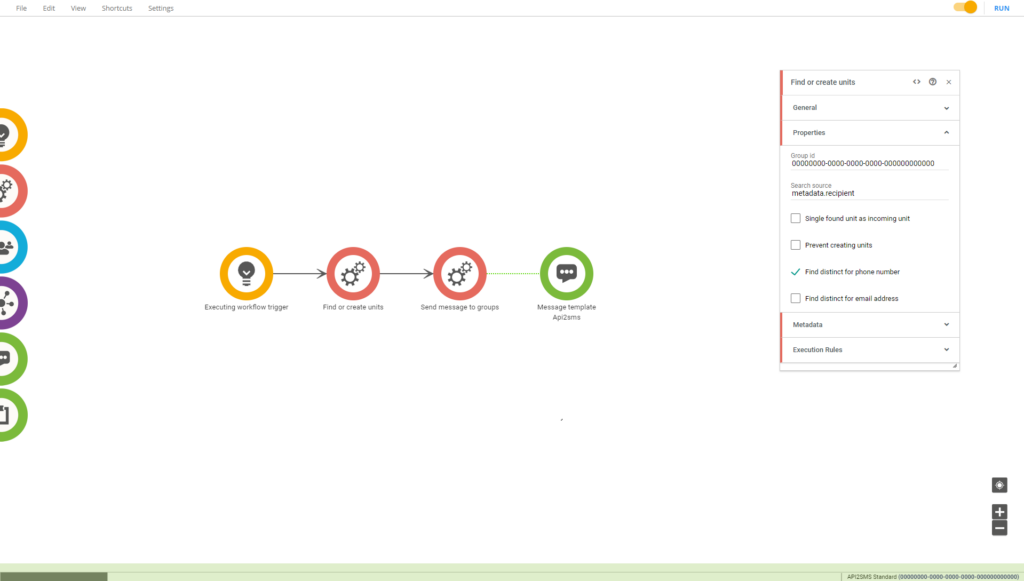
The resources added to this area are then connected by hovering the colored border and dragging an arrow to the next resource. Any jobs connected in a chain from a trigger will form a “flow” and can then be executed from that trigger. This is the workflow builder’s key feature and the actual code for your workflow.
Workspace
The workspace consists of the elements around the workflow area and contains the toolbox, property boxes, information bar, and zoom/pan controls.
Toolbox
The six circles found on the left side are the toolbox. These are the tools and resources that you use to build your workflows. Starting from the top are triggers, jobs, groups, units, message templates, and forms.
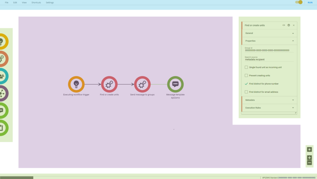
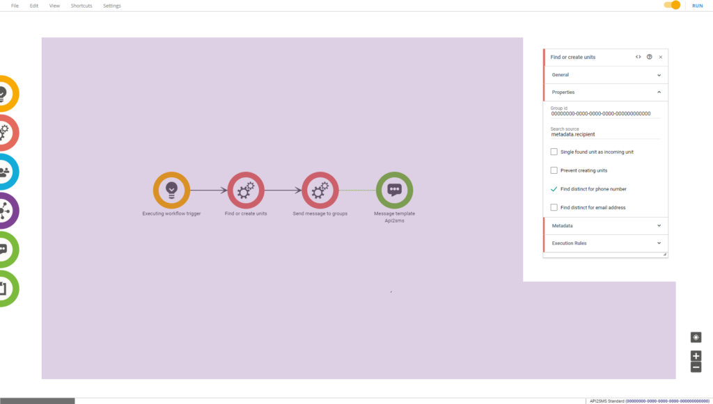
Properties
All triggers, jobs, and resources have properties that specify what they should do, what data they should store, and where to store it. The properties can be opened by double-clicking the resource’s icon.
Each trigger, job, or resource has their own set of properties related to the operation they are meant to perform and a few general properties that they all have in common.
Information bar
The workspace consists of the elements around the workflow area and contains the toolbox, property boxes, information bar, and zoom/pan controls.
Zoom/Pan controls
These controls are used to either zoom in, out, or center the screen on the workflow.
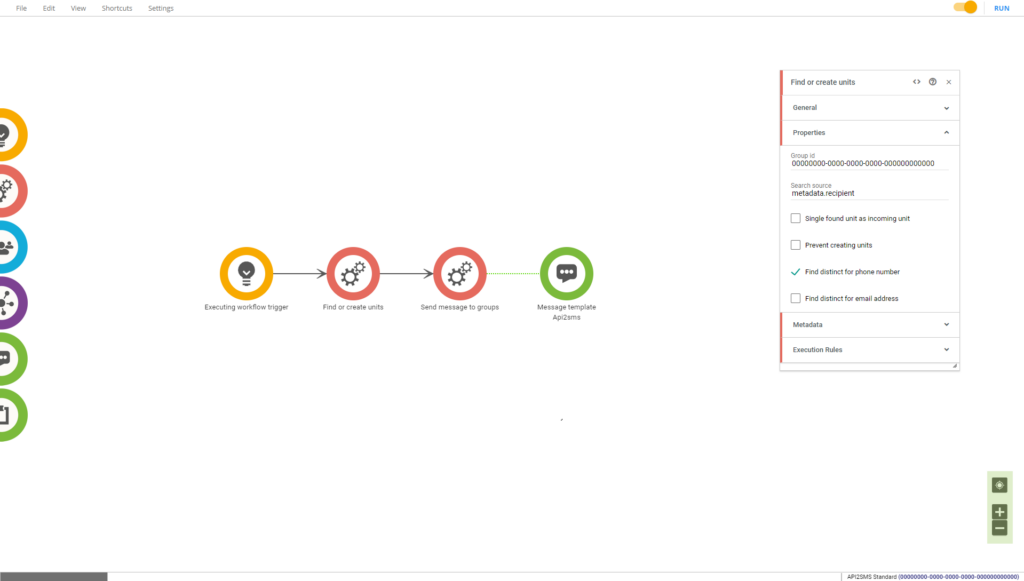
Menu bar
The menu bar can be found at the top of the screen and contains options for saving, copy-pasting, opening debugging windows, toggling the workflow’s active state, and running the workflow.
Activate workflow
When you have built your workflow and you want to run it, you must first activate it. You do this by using the workflow toggle found in the top right.
The toggle will be gray when the workflow is inactive and orange when it is active.
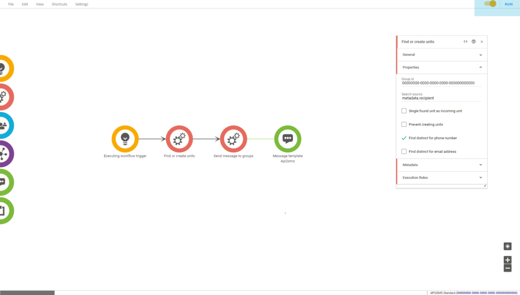
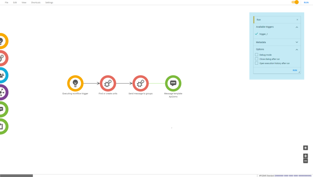
Run
When you have activated your workflow, you can click on “Run” to execute the workflow. This will bring up the “Run” dialog.
From here, you can select the triggers you want to execute, enter any specific metadata that you want to use in the execution, and specify any optional settings you might want to use.